My Documents
Create a separate domain in a closely collaborating cross-functional team for GetAccept.
Role
Product designer
Skills used
User research, Interaction design, Prototyping + Testing
Project
Work
Year
2024
Time frame
3 months
The background
During this initiative, I was the main designer in a cross-functional task force.
GetAccept is a Malmö-based B2B SaaS company aiming to optimize the buying and selling process. Learn more about GetAccept.
The problem
Users must go back to their emails to find a link to their received documents.
Users receive too many emails.
Users want to be able to keep track of all of their received documents easily.
Users want to know what they have to do with their received documents at a glance.
The goal
Create a view where users can easily access and see all of their received documents, and the actions they should take.
The process
We follow a lean methodology at GetAccept and have employed build-measure-learn in this case.
Building
Competitor analysis
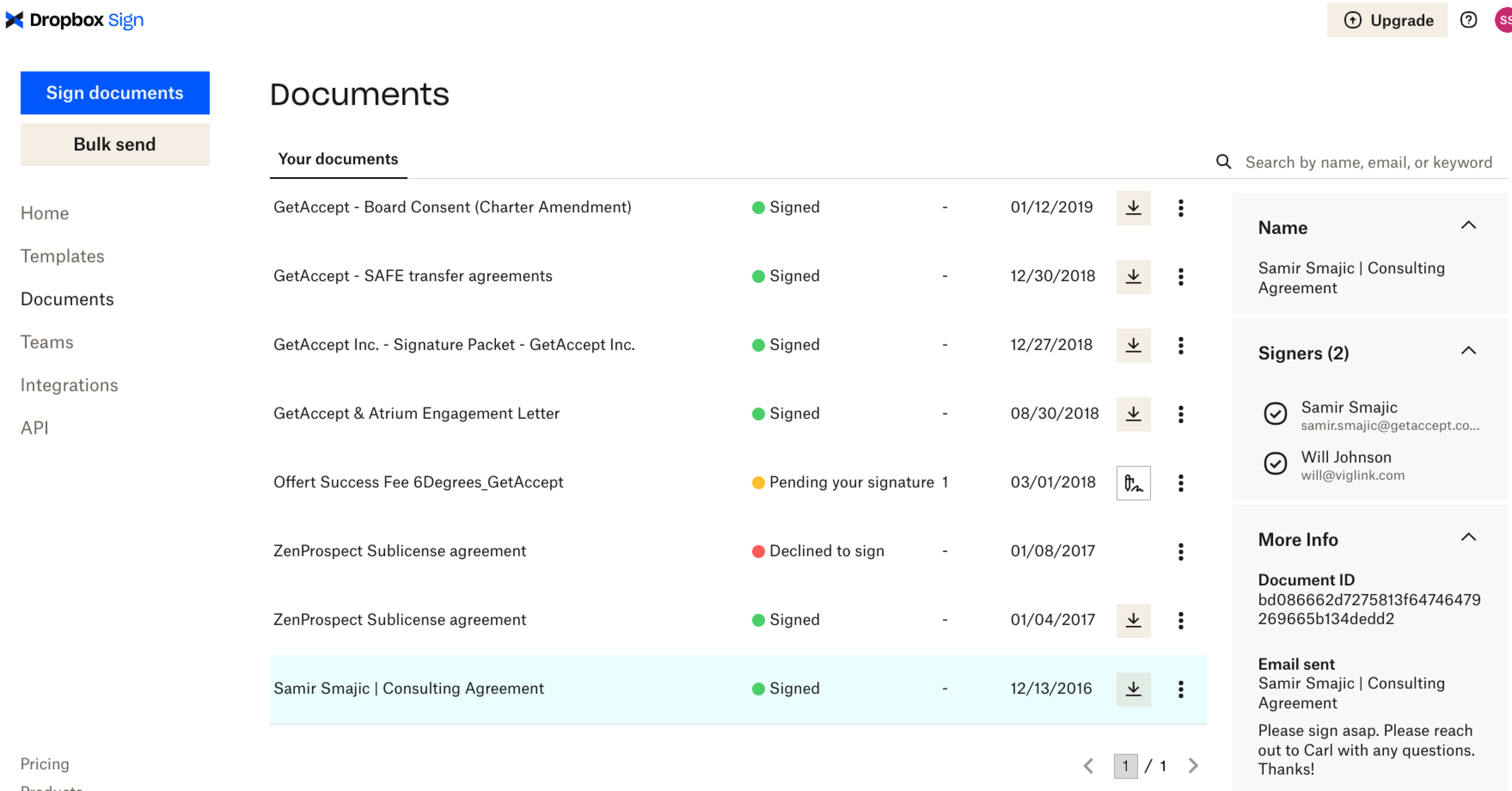
We investigated how competitors arranged their client portals, by looking at products like DocuSend and Dropbox Sign.
User research
Both our customers and internal users have experienced difficulties with keeping track of documents they’ve received. While our product manages sent documents, the recipients’ side is often forgotten.
We conducted internal interviews and talked to our customer-facing colleagues to pin down the pain points and what would be necessary in a recipient document portal.
We compiled this information into a MSCW list, and started ideating.
Prototype
We started with mapping out flows due to hard security limitations. As some of the documents are sensitive contracts, we needed to assure that whoever was accessing this portal was who they said they were. Login, security token expiration, and identification were plotted out together with the platform team and product manager.
We also created several different iterations of the portal at this point.
After presenting our flows and iterations to stakeholders, there were several back and forth discussions on what information in the portal were particularly important. We headed back to our customer-facing colleagues to ask for insights they had gathered from our users.
We were then able to decide on an MVP for our portal, and fleshed out details such as the empty state and wrote out acceptance criteria.
Measuring
Validation testing
We wanted to confirm that users could find “My Documents” so we did a simple task analysis test on Ballpark asking participants to find the entry point.
Learning
Reiterate
Following our validation testing was more fine-tuning iterating. Together with the frontend developer, we worked how to display all the necessary information and screen responsiveness.
Due to limited space on smaller screens, we had to decide together what information to prioritize in the table, and what information could be tucked into a side sheet.
The current design allows all the information to be viewed from the side sheet on a smaller screen, while maintaining the most important information (i.e., document name and action to take) in the table.
Results & takeaways
As this domain is newly released, we are still awaiting customer feedback.
Some key takeaways I’ve gained from this initiative are:
Close collaboration is key. Ideating with developers can save a lot of time and effort spent on reiterating.
Involve backend earlier in the process. While collaborating with frontend developers during solution ideation and iteration is a must, it’s easy to forget that backend needs to be involved at this stage also to avoid needless reiteration based on limitations from the platform.
More projects


